ACS UI Library
- Organization
- Microsoft
Azure Communication Services - Role
- Product lead and designer
Web, iOS, Android - Collaborators
- Alex Pereira
Jessica Downey
Danielle Hibbs
20+ engineers - Duration
- 2022 – Present
The ACS UI Library provides prebuilt voice, video, and chat interfaces for Azure Communication Services. Developers use it to add communication features to their products, from telehealth appointments to customer support.
As product lead and designer, I lead customer research, set the roadmap, and design interactions across web, iOS, and Android. I have led more than 40 features through release with a team of 20+ engineers.
My design focus is the relationship between shared defaults and customization. A call needs clear controls and accessible feedback from the first integration, while giving teams room to adapt the interface to their product.
Opportunity
Embedded communication
Teams in healthcare, finance, automotive, and retail needed voice and video within their existing products. Building the interface required more than a video window: callers needed to select devices, understand connection problems, and navigate with assistive technology.
Accessibility was a core requirement. Features such as Real-Time Text needed consistent behavior across the call experience. Providing them in the library reduced the work each customer team had to take on.
For Azure, the library also offered a more direct path from the communication APIs to a working product. Its value depended on whether developers could integrate it and adapt it to their needs.
Adoption was initially below expectations. I interviewed customers to understand what prevented them from using the library and used those findings to set design priorities.
Role
What I did
I led product and design work across web, iOS, and Android, in collaboration with the designers and engineers listed above.
- Interaction design
- Designed interaction models for RTT, call summaries, control bar overflow, and pre-call device setup.
- Visual design direction
- Directed visual design, including the opacity of RTT text states and component density across platforms.
- Design strategy and roadmap
- Prioritized work around customer adoption barriers, accessibility requirements, and emerging AI features.
- Customer research
- Interviewed customers including Teladoc, CVS, and OP Bank, then translated integration barriers into design priorities.
- Cross-platform leadership
- Coordinated design across three engineering teams, maintaining consistent interaction models while accounting for platform differences.
- Accessibility
- Led design work for Real-Time Text, including how callers enter, read, and follow text during a call.
System
Integration options
The library offers two levels of integration. Composites provide complete call and chat experiences; individual components support custom layouts and behavior. Both include accessibility and localization support.
Teams also need to choose their identity model, target platforms, and visual treatment. The design challenge was to support those choices without requiring every team to build a calling interface from scratch.
We used Storybook to make the components visible and testable within the documentation. Developers can explore states and configuration options before committing to an implementation.
CompositesPrebuilt experiences
Complete calling and chat interfaces: CallComposite, ChatComposite, and CallWithChatComposite. Each packages the components needed for a common scenario.
You control branding, layout presets, limited behavior overrides
ComponentsBuilding blocks
Individual interface components for teams that need custom layouts, styling, or behavior.
You control custom layout, styling, behavior, full observability
Core SDKsLow-level access
The underlying Calling, Chat, and Rooms SDKs provide communication capabilities for teams building their own interface.
You control the full interface, with responsibility for its design and implementation
Built on Fluent
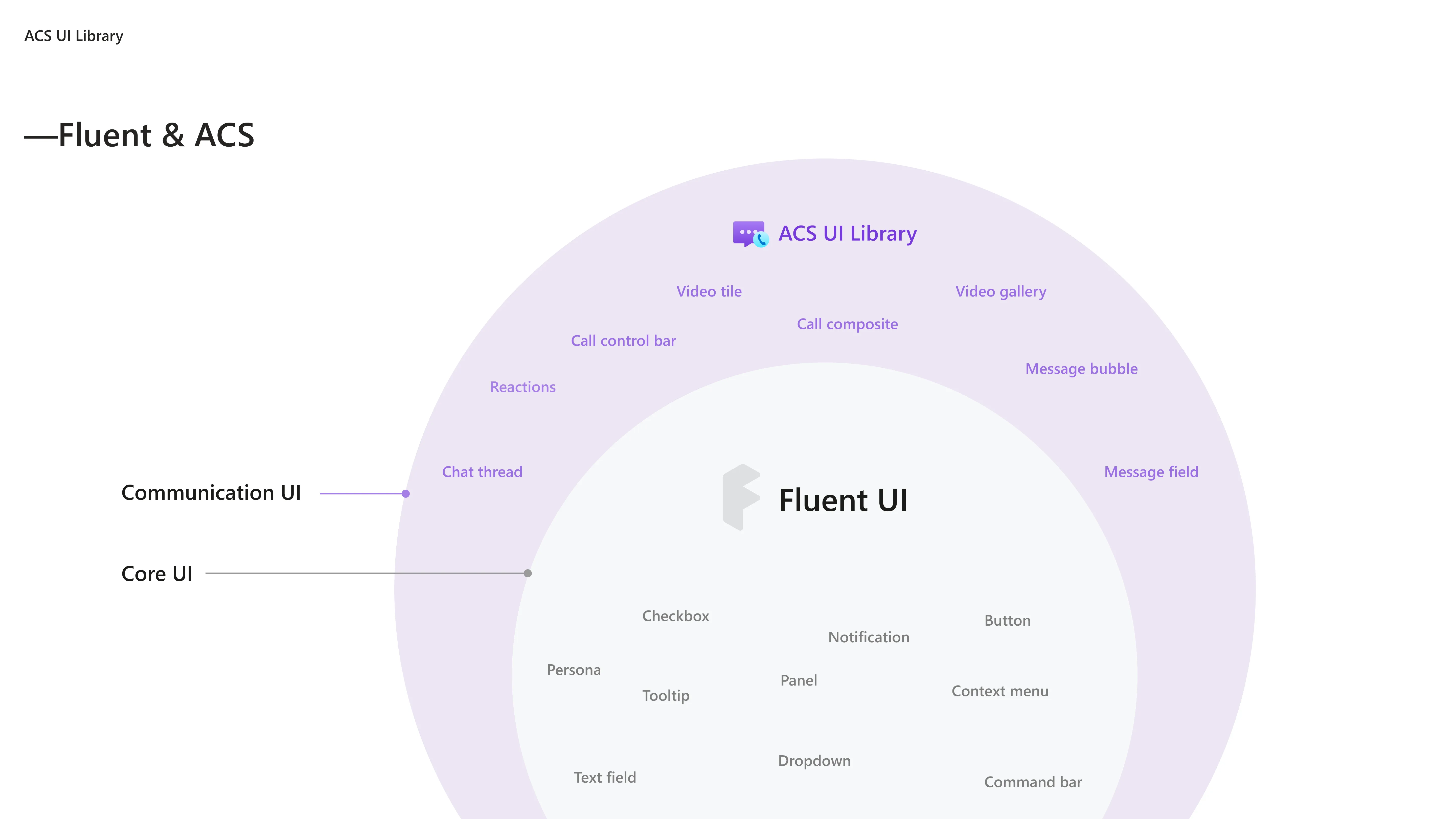
The library extends Fluent with communication-specific components. Buttons, panels, personas, and menus use Fluent primitives. Video tiles, the gallery, call controls, and message threads build on that foundation.
A shared theme provider keeps the call visually consistent with the surrounding product. Teams can apply their existing Fluent theme across the communication components.
Calling demo
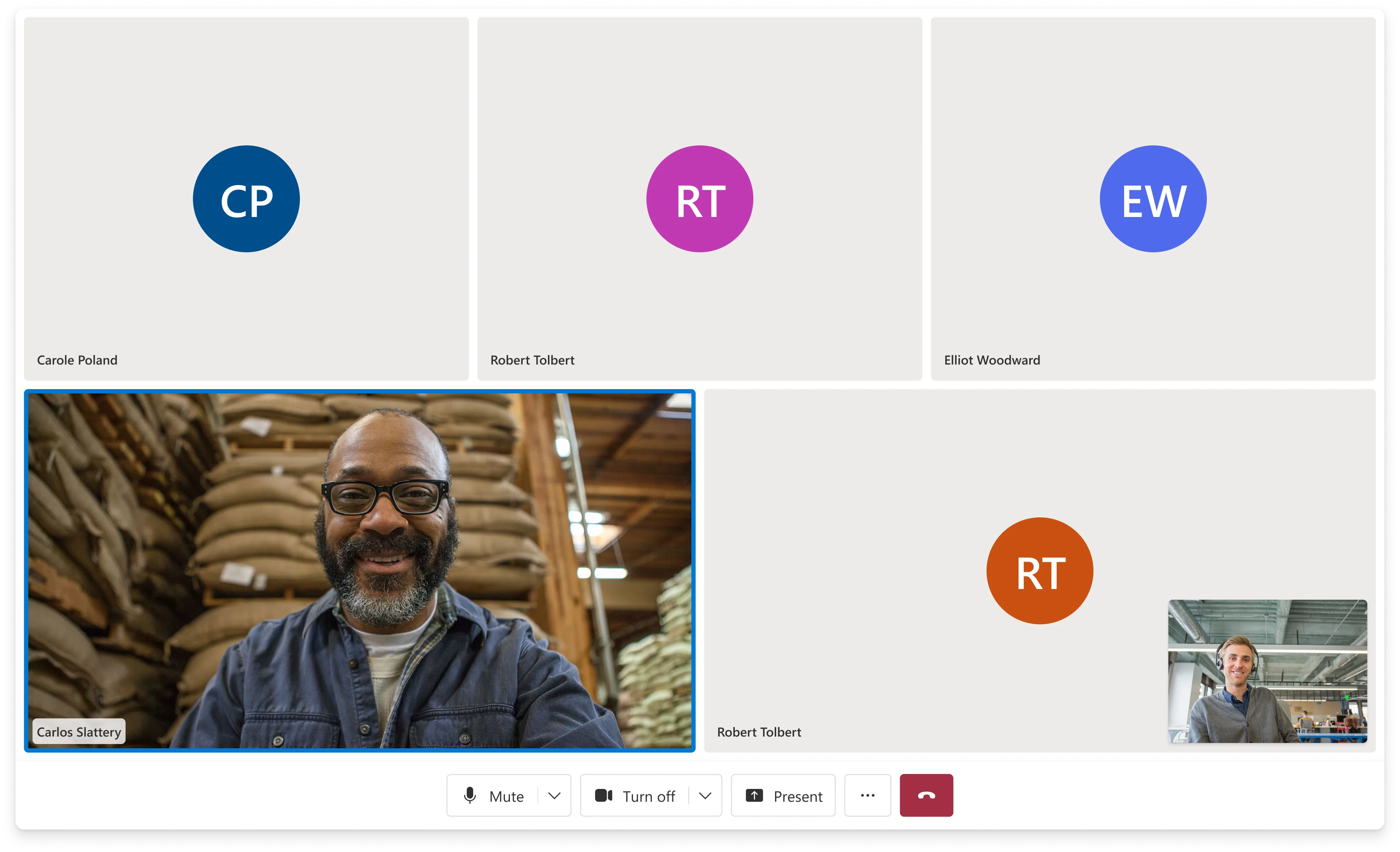
Explore a simulated call assembled from UI Library components. The demo brings the gallery, participant list, and call controls together in one interface.
Components
Each demo below isolates a component. Where configuration options are available, switch between them to compare layouts and behavior.
VideoGallery
The gallery balances active video, the local preview, and participants in the overflow row. Dominant-speaker tracking helps determine which participants remain visible as the conversation changes. The layouts below show how the gallery adapts to different arrangements.
ControlBar
The control bar supports horizontal, vertical, docked, and floating layouts. These options accommodate calls embedded in products with different space constraints. Floating variants use a background and shadow to keep controls legible over video; layouts also adapt to right-to-left reading.
MessageThread
Consecutive messages from one person share a name to reduce repetition. Dates and read receipts are optional and off by default, allowing teams to add the detail their conversation requires without making every thread equally dense.
SendBox + TypingIndicator
The composer pairs message entry with typing feedback. Long participant lists collapse into a name and a count, keeping the indicator readable within a single line. Try entering a message to see the interaction.
ParticipantList
Mute and video status appear directly in each participant row. Actions affecting another participant are grouped in a menu and shown only when the app grants permission. The same roster can support peer conversations and moderated calls.
Device selection
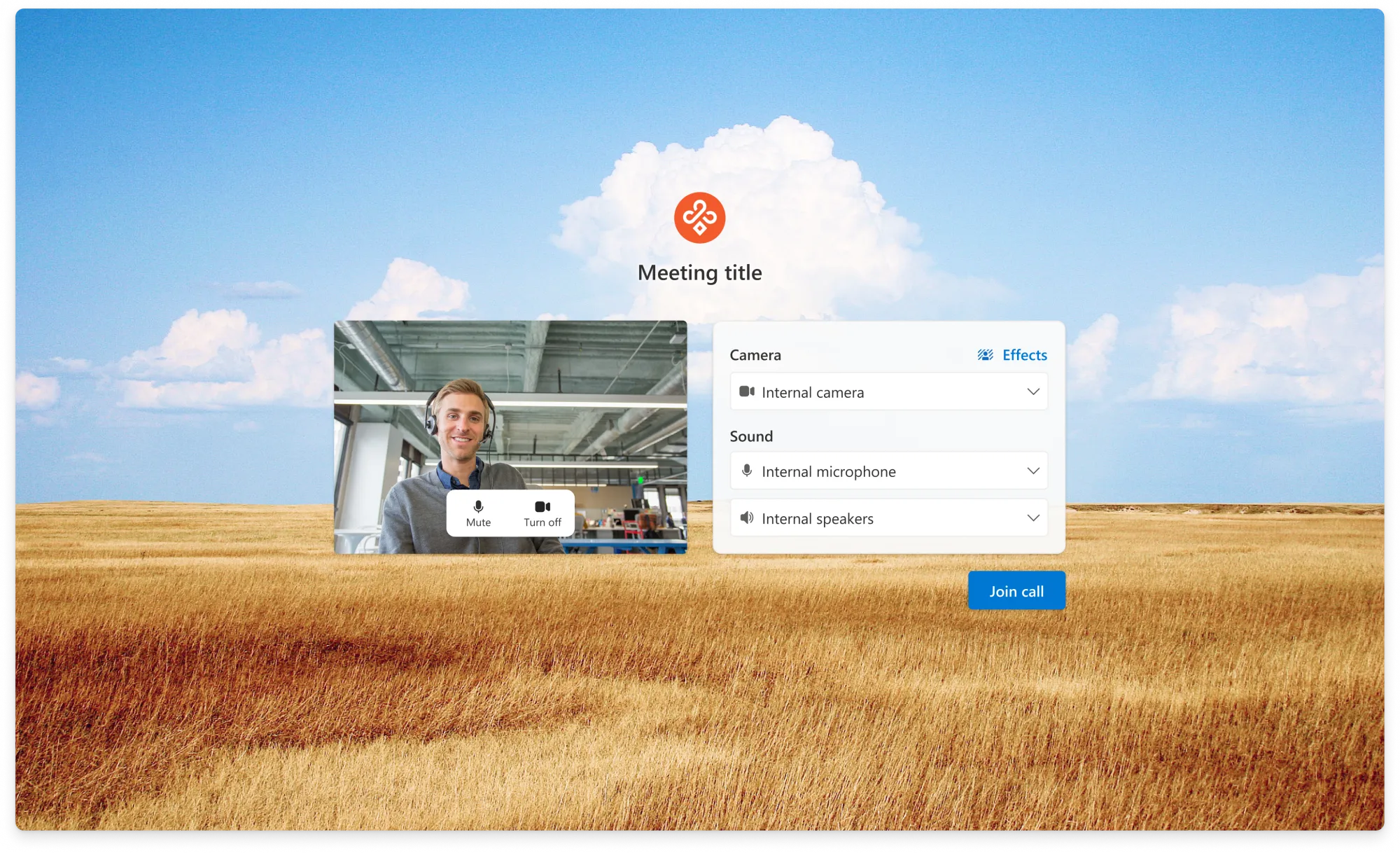
Split buttons keep common actions directly accessible: turning the camera on takes one click, while choosing which camera to use sits in the adjacent menu. Device options reflect browser capabilities, so callers only see selections the browser supports.
RealTimeText
Real-Time Text lets callers communicate as they type. Text appears in the main call stage so participants can follow it alongside the conversation. Once activated, RTT remains available to everyone for the rest of the call.
Customization and brand
Teams can adapt the call to their brand through a shared Fluent theme provider. Color and visual treatment can change while the underlying interactions remain consistent. Theme choices still need to meet accessibility requirements.
Sample Builder
The Sample Builder guides teams through template selection, bookings, theming, and post-call options. They can review the configured experience, then deploy to Azure, download the project, or clone it from GitHub.
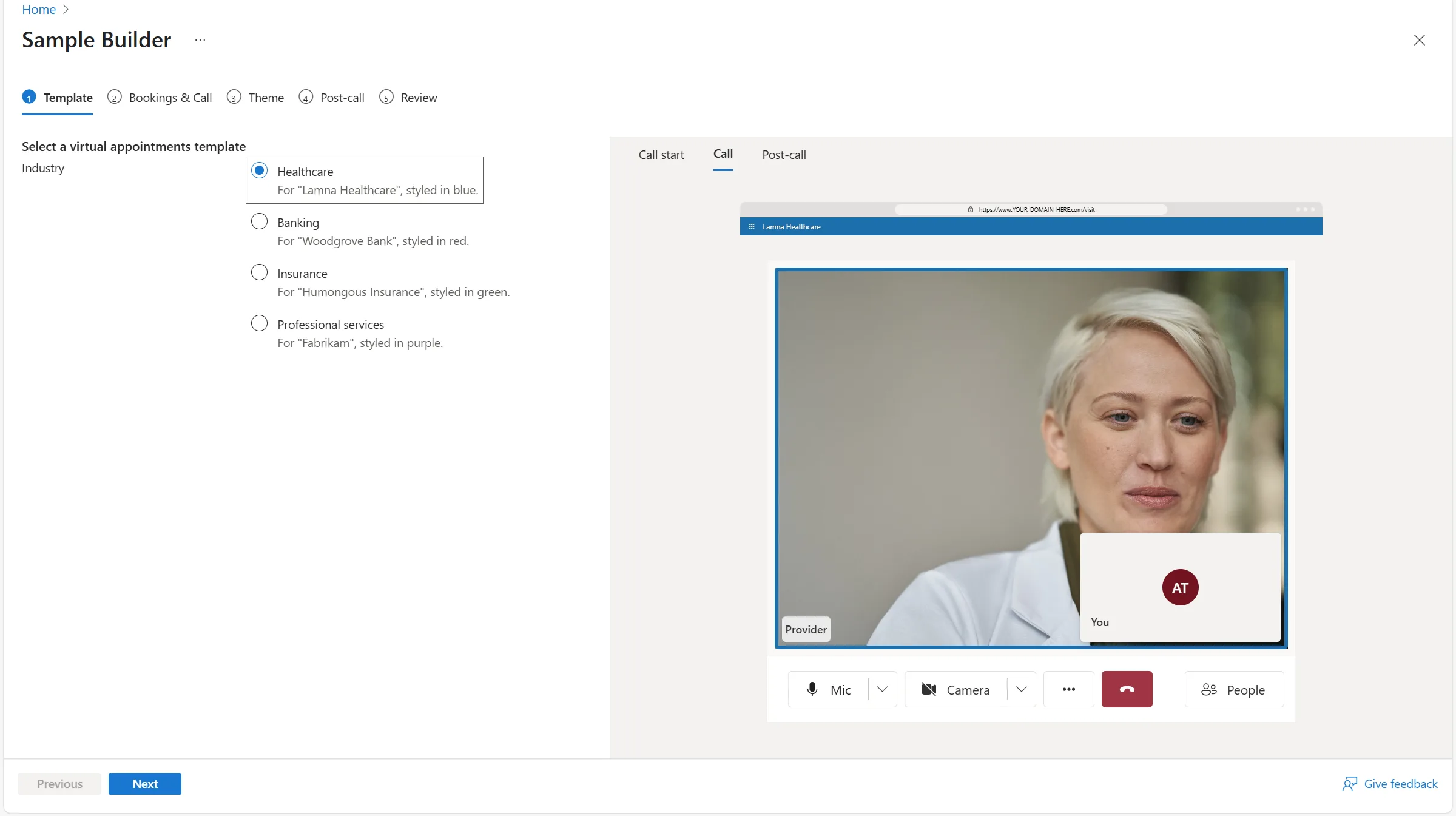
We added transcription and call summaries to the Sample Builder so teams could evaluate them in a working call before integrating them. The downloadable sample provided an implementation they could extend.
Outcome
Product adoption
The library reached more than 200 businesses. Monthly usage grew from roughly 2 million minutes at the start of 2025 to more than 11.1 million by year-end. These figures reflect adoption of the library as a whole, supported by the wider team’s work.
11.1M+
Monthly minutes by the end of 2025, up from roughly 2M at the start of the year
200+
Businesses onboarded across healthcare, finance, automotive, and retail
40+
Features I led from design through release, in collaboration with engineering